Loyalty Enrollment report
The Loyalty Enrollment Report is located in the Report Catalog. This report allows you to view and track enrollment metrics in aggregate and by location.
Tip: You must have an Account Group selected or applied to your user to view all of the reports.
Filters
You can target specific data within your report by using the available filters on top. These filters include:
View
Allows you to control your report view and how the metrics are broken out. Options include Aggregate and By Location with 'Aggregate' being the default.
Date range
Allows you to filter based on the enrollment date. You can select start and end dates, with the default selections spanning the last six months.
- Start dates begin as of 12:00:00AM of the chosen date.
- End dates end as of 11:59:59PM of the chosen date.
Location Type
Allows you to change whether you are viewing enrollment based on the Activating Location or Enrolling Location. The Location Type filter only appears when you view the report by location.
MORE FILTERS
Click MORE FILTERS to open a drawer from which you can choose additonal filters to apply to the report, including Activating Location, Enrolling Location, and Segment.
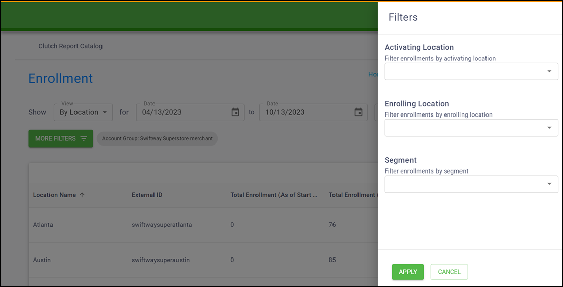
Select from the additonal filters and click Apply to update the report.
If your user has a group and/or location applied in the Account menu, the data is filtered to show only data for that specific group and/or location. When these filters are applied to the report you are viewing, they appear in the More Filters section.
Once the filters are in place, click Update to update the report.
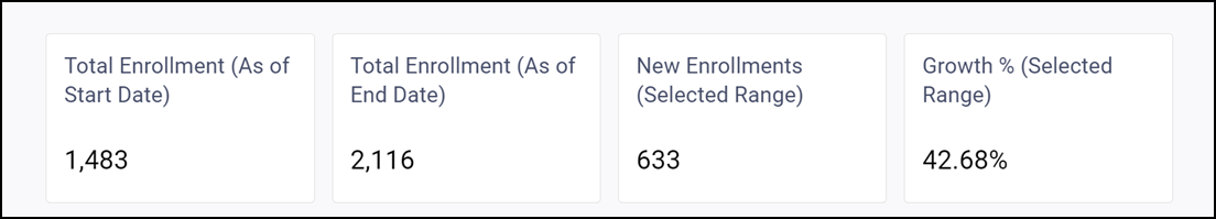
Aggregate view
You can see a variety of data within the reporting table when in Aggregate view, including a variety of infoboxes and a trend over time chart.
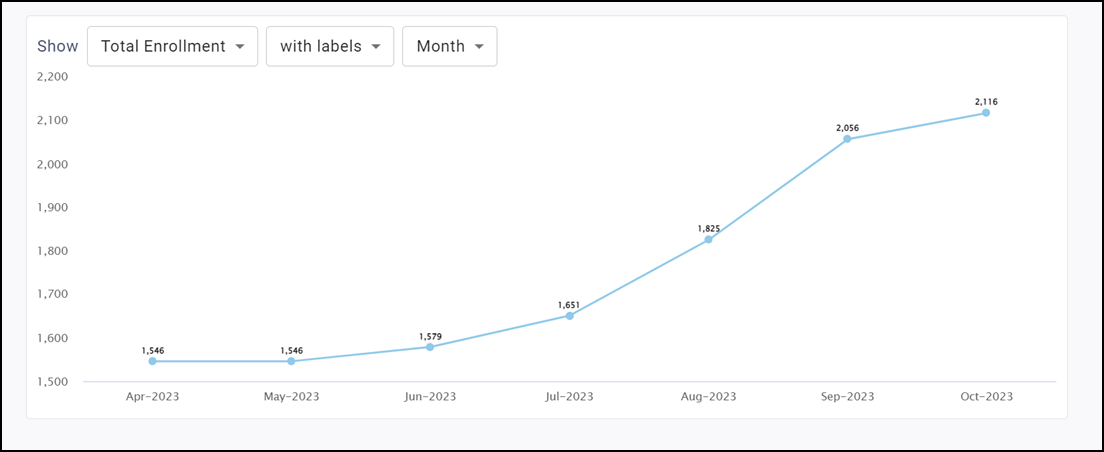
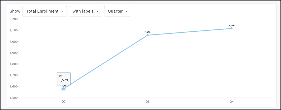
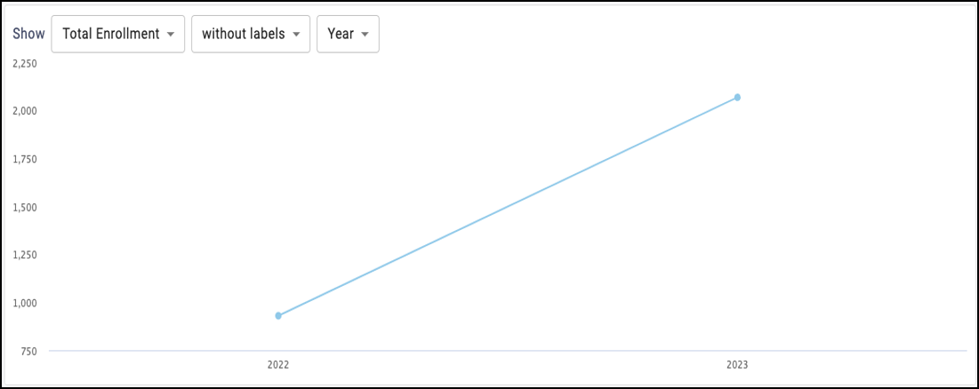
Trend Over Time chart
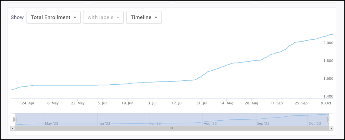
The line graph shows various sales metrics over time. You can alter the time period as well as show the information with or without labels.
The metrics you can view are Total Enrollments and New Enrollments.
Labels
Use the Labels drop-down to toggle between showing labels on the graph or not. Selecting 'with labels' displays a more detailed graph containing labels. Selecting 'without labels' displays a cleaner graph.
Note: This feature is disabled for the Timeline version of this graph.
Timespan drop-down list
You can determine the timespan of the chart by toggling between Timeline, Month, Quarter, or Year. Read below to learn more about these timespan options.
Timeline
Displays a trend over time chart that plots metrics by day. Use the bar on the bottom of the chart to zoom in or out to different date ranges on the timeline. All data for the selected date range appears. If more than a year is chosen for a date range, the Timeline option is disabled and the graph defaults to the Month view.
Month
Displays a trend over time chart that summarizes metrics by month.
Quarter
Displays a trend over time chart that summarizes metrics by quarter.
Year
Displays a trend over time chart that summarizes metrics by year.
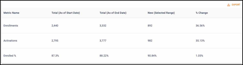
Metrics table
The graph shows a variety of metrics over the specified timeframe, inlucding the:
- Total (as of start date)
- Total (as of end date)
- New (selected range)
- % change
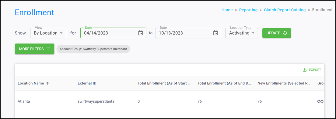
Location view
You can see a variety of data within the reporting table when you view the report using the By Location view.
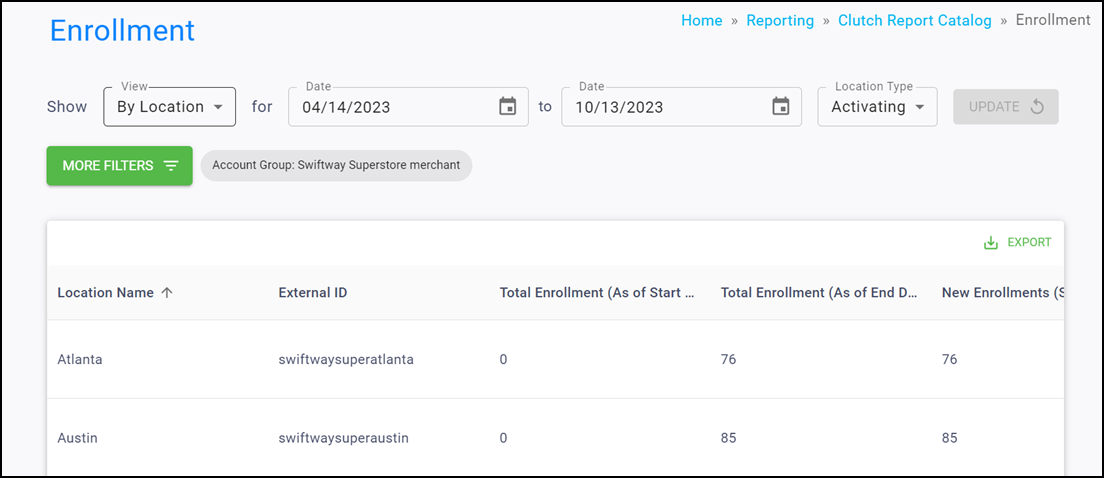
The following columns are available when using this view:
- Location Name
- External ID
- Total Enrollment (As of Start Date)
- Total Enrollment (As of End Date)
- New Enrollments (Selected Range)
- Growth % (Selected Range)
- Total Activated (As of Start Date)
- Total Activated (As of End Date)
- New Activations (Selected Range)
- Enrolled % (As of Start Date)
- Enrolled % (As of End Date)
- Enrolled % Change (Selected Range)
Note: Click EXPORT in the top right corner to download the table results as a CSV. You can temporarily rearrange table columns by holding click on the column header and dragging to the left or right. These changes pass through to the export and reset when you reload the page.
Metric definitions
| Metric Name | Definition |
|---|---|
| Total (As of Start Date) | The metric value as of the selected start date. |
| Total (As of End Date) | The metric value as of the selected end date. |
| New (Selected Range) | The metric value during the selected date range. |
| % Change | The % difference between the Total (As of End Date) and Total (As of Start Date).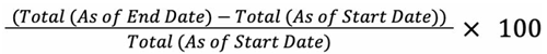 |
| Total Enrollments | The count of enrolled cards. |
| New Enrollments | The count of newly enrolled cards. |
| Growth % | The % difference in Total Enrollment between the selected Start Date and End Date. |
| Total Activated | The total count of activated cards. |
| New Activations | The count of newly activated cards. |
| Activation Growth % | The % difference in Total Activated between the selected Start Date and End Date. |
| Enrolled | The percentage of activated cards that are enrolled. |
| Enrolled % Change | The % difference in Enrolled % between the selected Start Date and End Date. |