Program Enrollment report
The Program Enrollment report allows you to view and track multi-program enrollment metrics.
Note: Be sure you have an Account Group selected or applied to your user to view all of the reports.
Filters
You can target specific data within your report by selecting from MORE FILTERS. These filters include:
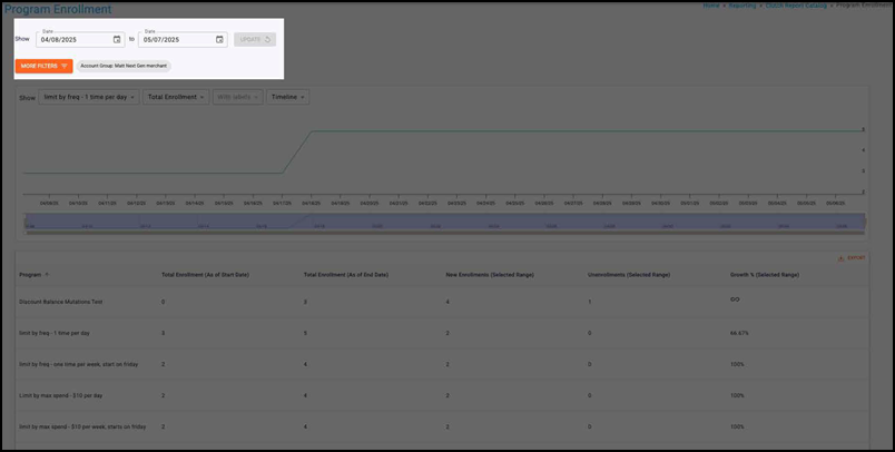
Date Range — This allows you to filter based on the transaction date. You can select start and end dates. The default for this is the last six months.
- Start dates begin as of 12:00:00AM of the chosen date.
- End dates end as of 11:59:59PM of the chosen date.
MORE FILTERS — Opens a drawer to give you a list of additional optional filters to apply to the report, including Location Segment, Activating Location, and Segment. Note that if your user has a Group and/or Location applied in the Account menu, the data may be filtered to that specific Group and/or Location. If these filters have been applied to the report you are viewing, you will see them in the More Filters section.
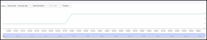
Trend Over Time Chart
Program
Use the Program drop-down to choose the program to plot in the chart Selections vary based on your available programs.
Metrics
Use the Metrics drop-down to choose the metric to plot in the chart. Options include:
- Total Enrollment
- New Enrollments
- Unenrollments
Labels
Use the Labels drop-down to toggle whether data labels appear on the graph or not. Selecting with labels displays a more detailed graph containing labels. Selecting without labels displays a cleaner graph.
Note that this feature is disabled for the Timeline version of this graph.
Timespan drop-down
Use the Timespan drop-down to determine the timespan of the chart. It can toggle between Timeline, Month, Quarter, or Year. Read below to learn more about these timespan options.
Timeline: — This displays a trend over time chart that plots metrics by day. The bar on the bottom of the chart can be used to zoom in or out to different date ranges on the timeline. All data for the selected date range will be displayed. If more than a year is chosen in the Date Range picker, the Timeline option will be disabled, and the graph will default to the Month view.
Month: &mdash: Displays a trend over time chart that summarizes metrics by month.
Quarter: — Displays a trend over time chart that summarizes metrics by quarter.
Year: — Displays a trend over time chart that summarizes metrics by year.
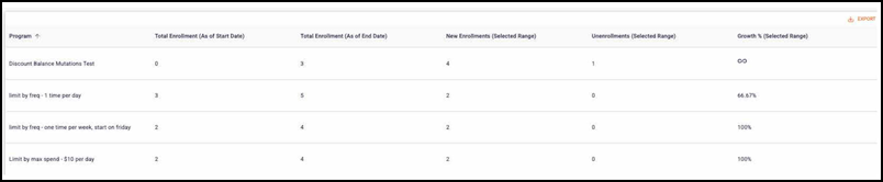
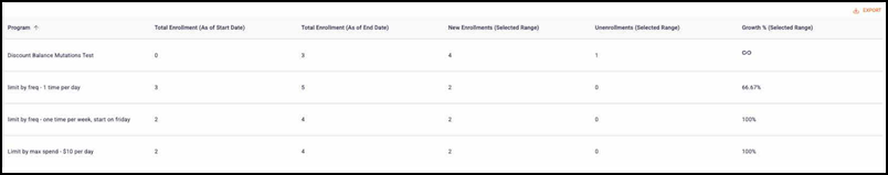
Report table
You can view a table containing the following metrics for the selected timeframe:
- Program
- Total Enrollment (As of Start Date)
- Total Enrollment (As of End Date)
- New Enrollments (Selected Range)
- Unenrollments (Selected Range)
- Growth % (Selected Range)
Metric Definitions
| Metric Name | Description |
|---|---|
| Total Enrolllment | The count of enrolled cards. |
| New Enrollments | The count of newly enrolled cards. |
| Unenrollments | The count of newly unenrolled cards. |
| Growth % | The % difference in Total Enrollment between the selected Start Date and End Date.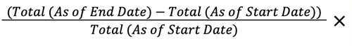 |