Sales report
The Sales report is located in the Report Catalog. This report allows you to view sales metrics in aggregate, by location, and by loyalty status, including transactions, net sales, average order value, basket size, and discount.
Tip: You must have an Account Group selected or applied to your user to view all of the reports.
Filters
You can target specific data within your report by using the available filters on top. These filters include:
View
Allows you to control your report view and how the metrics are broken out. Options include Aggregate, By Location, and By Loyalty Status. Note that Aggregate is the default.
Date range
Allows you to filter based on the transaction date. You can select start and end dates, with the default selection spanning the last six months.
Currency type
Allows you to filter based on the currency type of the location where the transaction occurred. USD is the default unless your brand does not have any USD locations.
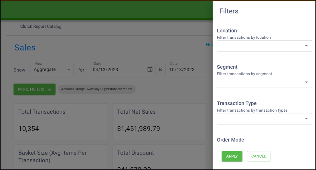
MORE FILTERS
Click MORE FILTERS to open a drawer from which you can choose additional filters to apply to the report, including Location, Segment, Transaction Type, Order Mode, Revenue Center, and SKU.
Although you may be able to see all of these filters, they may not all apply based on the configuration of your brand data.
Select from the additional filters and click Apply to update the report.
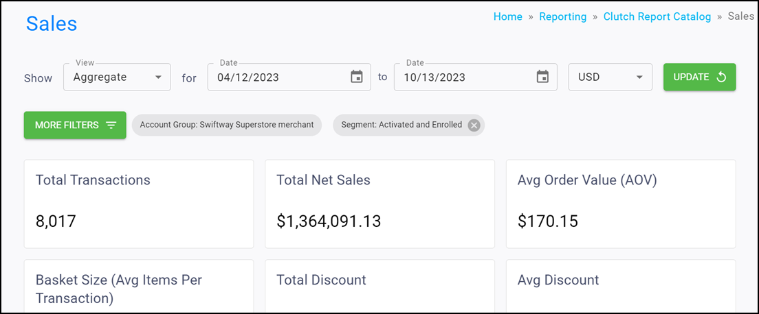
If your user has a group and/or location applied in the Account menu, the data is filtered to show only data for that specific group and/or location. When these filters are applied to the report you are viewing, they appear in the More Filters section.
Once the desired filters are in place, click Update to update the report.
Report views
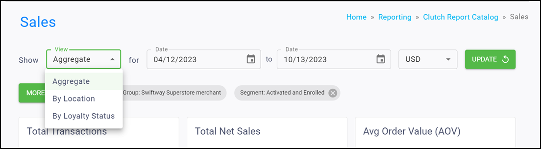
Your report view changes depending on your view choice. You can select from Aggregate, By Location, and by Loyalty Status.
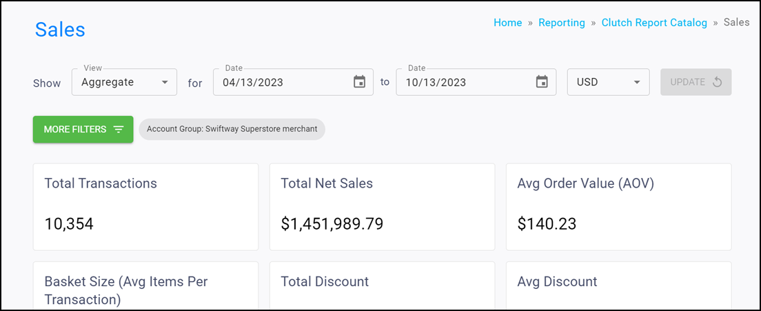
Aggregate view
Read below to learn about the information you can gather from the infoboxes while in Aggregate view.
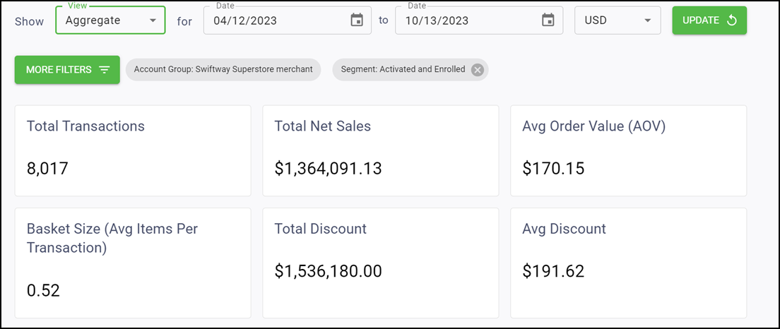
Total Transactions — Shows the total purchases minus voids.
Total Net Sales — Shows the total amount minus voids and discounts.
Avg Order Value (AOV) — Shows the total net sales divided by total transactions.
Basket Size (Avg Items Per Transaction) — Shows the total number of purchase items divided by the total transactions.
Total Discount — Shows the total amount of discount applied to transactions.
Avg Discount — Shows the total discount divided by the total transactions.
Trend over time chart
Read below to learn what information you can gather while in the Trend Over Time Chart view.
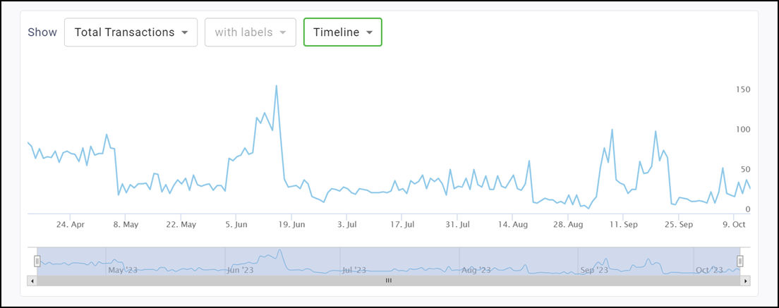
The line graph shows various sales metrics over time. You can alter the time period as well as show the information with or without labels.
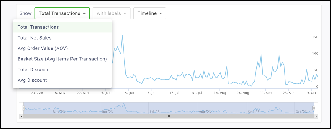
Available metrics while in Trend Over Time Chart view:
- Total Transactions
- Total Net Sales
- Avg Order Value (AOV)
- Basket Size (Avg Items per Transaction)
- Total Discount
- Avg Discount
Labels
Use the Labels drop-down to toggle between showing labels on the graph or not. Selecting 'with labels' displays a more detailed graph containing labels. Selecting 'without labels' displays a cleaner graph.
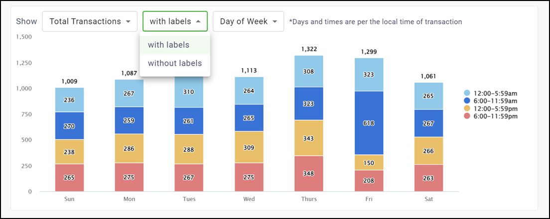
Tip: This feature is disabled for the Timeline version of this graph.
Timespan drop-down list
You can determine the timespan of the chart by toggling between Timeline, Month, Quarter, or Day of Week. Read below to learn more about these timespan options.
Timeline
Displays a trend over time chart that plots metrics by day. Use the bar on the bottom of the chart to zoom in or out to different date ranges on the timeline. All data for the selected date range appears. If more than a year is chosen for the date range, the Timeline option is disabled and the graph defaults to the Month view.
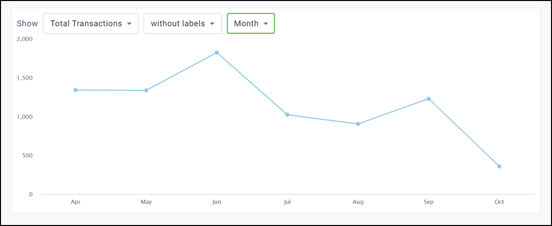
Month
Displays a trend over time chart that summarizes metrics by month. If you select more than one year, each year is broken out into a different series allowing you to do a comparison.
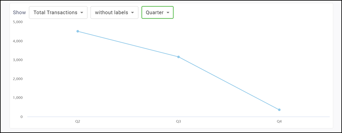
Quarter
Displays a trend over time chart that summarizes metrics by quarter. If more than one year is selected, each year is broken out into a different series allowing you to do a comparison.
Day of Week
Displays a stacked column chart that breaks metrics out by the day of the week and time of day.
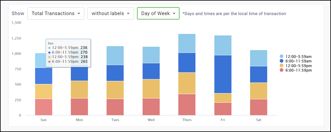
Note: The system assigns metrics to time-of-day groupings according to the local time of the transaction. For example, if you have locations in both New York and Los Angeles with transactions that occur at 8a.m. local time for each location, the system assigns both to the 6:00-11:59 a.m. group.
By Location view
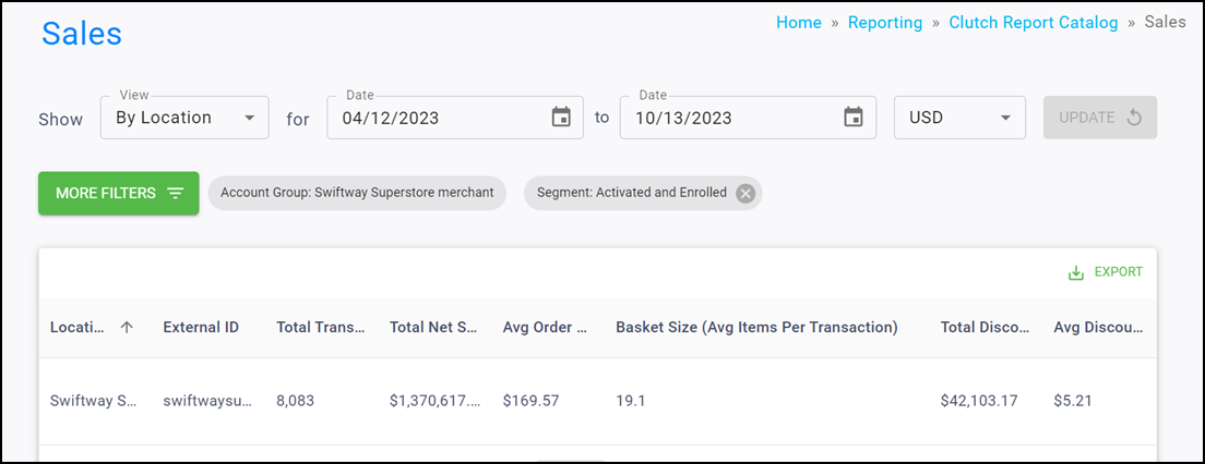
When in By Location view, the report table appears with the following columns:
- Location Name
- External ID
- Total Transactions
- Total Net Sales
- Avg Order Value (AOV)
- Basket Size (Avg Items Per Transaction)
- Total Discount
- Avg Discount
Note: Click Export in the top right corner to download the table results as a CSV. You can temporarily rearrange table columns by holding click on the column header and dragging to the left or right. These changes pass through to the export and reset when you reload the page.
By Loyalty Status view
The Loyalty Status view breaks out the sales metrics by Loyalty Status.
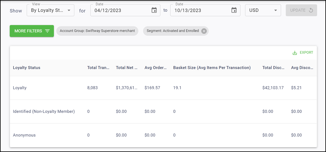
You can see information on:
- Loyalty Customers (transactions that are tied to an enrolled card)
- Identified Customers (transactions that are tied to a card that has activated, but not enrolled)
- Anonymous Customers (transactions that are not tied to a card).
Report Table view
The Report Table view shows the following columns:
- Loyalty Status
- Total Transactions
- Total Net Sales
- Avg Order Value (AOV)
- Basket Size (Avg Items Per Transaction)
- Total Discount
- Avg Discount
Note: Click EXPORT in the top right corner to download the table results as a CSV. You can temporarily rearrange table columns by holding click on the column header and dragging to the left or right. These changes pass through to the export and reset when you reload the page.
Trend over time chart
The line graph shows various campaign metrics over time, with the default metric being Total Transactions. You can alter the time period as well as show the information with or without labels.
The metrics you can view are:
- Total Transactions
- Total Net Sales
- Avg Order Value (AOV)
- Basket Size (Average Items per Transaction)
- Total Discount
- Avg Discount
Labels
Use the Labels drop-down to toggle between showing labels on the graph or not. Selecting 'with labels' displays a more detailed graph containing labels. Selecting 'without labels' displays a cleaner graph.
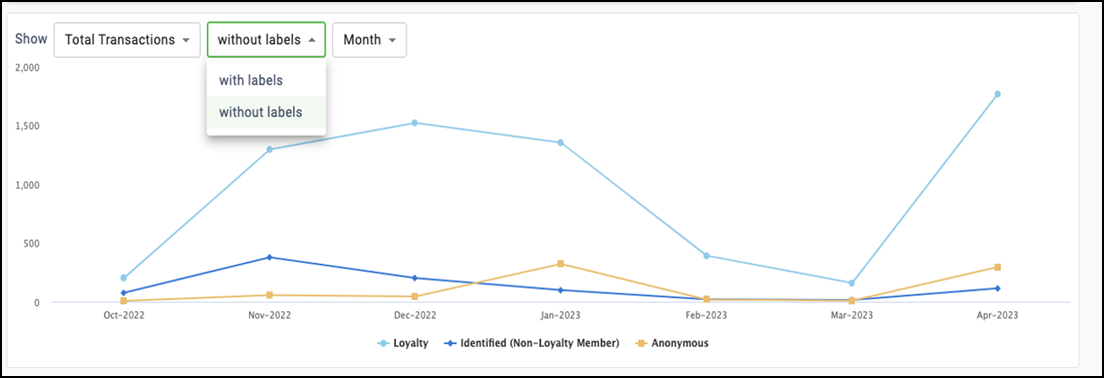
Note: This feature is disabled for the Timeline version of this graph.
Timespan drop-down list
You can determine the timespan of the chart by toggling between Timeline, Month, Quarter, or Day of Week. Read below to learn more about these timespan options.
Timeline
Displays a trend over time chart that plots metrics by day. Use the bar on the bottom of the chart to zoom in or out to different date ranges on the timeline. All data for the selected date range appears. If more than a year is chosen for the date range, the Timeline option is disabled and the graph defaults to the Month view.
Month
Displays a trend over time chart that summarizes metrics by month.
Quarter
Displays a trend over time chart that summarizes metrics by quarter. If more than one year is selected, each year will be broken out into a different series, so you can compare them.
Legend
To show or hide any of the categories in the chart legend, click the name in the key. For example, to hide Anonymous customers, click Anonymous in the legend. Click it again to allow the data to reappear.
Stacked Percentage chart
The Stacked Percentage chart plots your total sales metrics over time with percentage breakouts for each loyalty group.
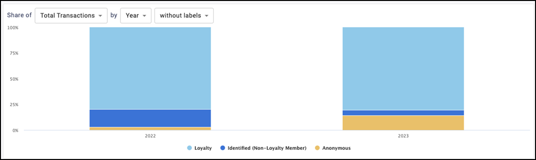
You can view the following metrics:
- Total Transactions
- Total Net Sales
- Total Discount
Timespan drop-down list
You can determine the timespan of the chart by toggling between Year, Month, or Quarter. Read below to learn more about these timespan options.
Year
Displays a trend over time chart that summarizes metrics by year.
Quarter
Displays a trend over time chart that summarizes metrics by quarter.
Month
Displays a trend over time chart that summarizes metrics by month.
Legend
To show or hide any of the categories in the chart legend, click the name in the key. For example, to hide Anonymous customers, click Anonymous in the legend. Click it again to allow the data to reappear.